Sensational graphics
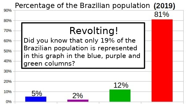
It is scary to know that in this graph, the red column represents a population about 426% larger than the other columns combined. Some may think that this chart is false or that the data has been manipulated to favor an idea. However, it is sad to admit that this graph is correct and that tells us a lot about how we perceive the information.
The idea for this post came up some time ago when I watched Monty Python, and I came across the painting “Spectrum – Talking About Things” from episode 12 of the series, entitled “The Naked Ant”. In this episode, the TV presenter shows the graph below while talking about its meaning:
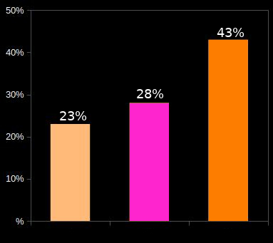
“In this graph, this column represents 23% of the population. This column represents 28% of the population, and this column represents 43% of the population. Telling figures indeed.”
The irony is that both this graph and the one presented at the beginning of the post are correct at the same time that they say nothing.
Both refer to the percentage of the population represented by column charts, in which each column has its relative size with the percentage of the population it represents, and that is all.
Okay, this post was about a “joke”, is that it? No. The idea of this text is to talk a little about graphics and their power to be a sensationalist, even within the university environment. I have seen many presentations of projects and research results, both from new people and more experienced staff, and there is this tendency to “put a graph” in the middle.
In fact, some graphics allow you to see things with clarity and immediate perception, you can identify differences or propose constructs from them, and even understand the results of long studies in a simple way. When used well, graphics help immensely in understanding the information presented, but the opposite is also true. So it is a care to be taken when “by a graph”, is he saying something important about what I want to inform? Also, is the chart structure suitable for this type of information? A pie chart for a population of two subjects is redundant, although I have seen some of them.
In general, before putting a graph, I like to try various formats available in the software I’m using, even if I already have more or less in mind which one I want, sometimes we end up being surprised by how the information fits better in a somewhat unusual format.
Just so as not to complete the post without any example graphic, I will take the opportunity to do a little merchandazing on this blog. During the 686 days that this blog is active (first post was on June 1, 2019, and today is April 17, 2021), we had 63,337 views and of the 172 posts published, the 10 posts with the most views had the following amounts of views:
Quantos graus tem o ângulo interno de um polígono regular de infinitos lados? // 7.061 views
Matemática vs Cadeados de Segredo // 6.422 views
Earth-Prezel Hypothesis // 2.939 views
Código ENEM – o padrão secreto da prova // 2.787 views
Lado Negro do Xadrez // 2.451 views
Leite no cereal: bebida, caldo ou molho? // 2.022 views
Séries retráteis // 1.749 views
Primo de Sheldon // 1.678 views
Produto Vetorial explica o Poder de Luta em Dragon Ball// 1.571 views
Calm down Pythagoras… we solve this // 1.309 views
All other posts // 29.989 views
Expressing this in a graph can be a little clearer:
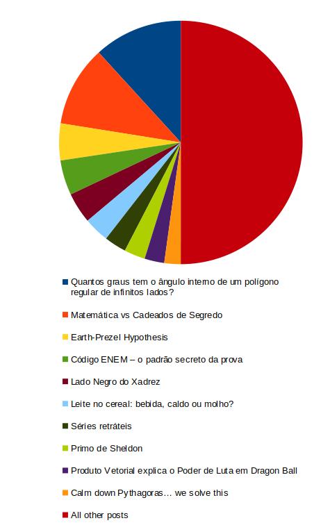
With a glimpse we see that the 10 most read, almost equal the views of all the other 162 posts together (wow, what a powerful graphic!).