Whatever she wants – sexual selection
This post was translated by Igor Santos from the original published by Atila at the Brazilian blog Rainha Vermelha.
==================================================================

Sexual selection is not the freshest of news. Darwin’s grandfather Erasmus had already commented on it. [1]
But a very pertinent question is why it occurs, or at least, what is selected. After all, why does a female finds a male sexy?
Two hypotheses could explain that. Fisher proposed the sexy gene hypothesis. He argues that, whatever the characteristic chosen by females, if it comes from a gene, that gene must become common within a population just because it has been picked up. A female that chooses a male with the sexy gene will have offsprings with that very gene, which in turn will be chosen by other females, spreading it.
The other hypothesis is the good genes one. According to it, when females prefer a certain trace, they are actually opting for a male’s good health, reflected on that given trace. For instance, a male with bright red feathers that uses carotene to increase the redness. Only a very healthy male has enough carotene to “waste” on plumage, so whoever gets the redder male will have healthier offspring and will have been favored by sexual selection.
Both hypotheses seem to be correct. It all depends on the cost involved in the choice. When its not too cost-intensive for the females to choose (e.g. birds that gather for “exhibition parades” with heaps of males, sexy gene might prevail, like in peacock’s tails). In other scenarios, where choice uses resoures, be it looking around for males or exposing their presence to predators for the exhibition, the selected characteristic must have added value, a good gene.
But neither hypothesis explain how a characteristic begins to be selected. Why do females prefer a certain color, a song or any other thing? Where does the preference come from?
Like with most frogs, the song is used to attract partners. But in closer-related species, males don’t do the second part, they only chant the “win” bit. Now a bizarre fact.
When the P. pustulosus melody was played through loudspeakers to females of other close-related species, they like it better than their own species’ call! They prefered the screeching end, albeit they had never heard it before, since their own kind does not do it. Therefore, they already have the nervous circuit that make them like that kind of song better, but only the P. pustulosus males use them.
There is a bias preference amongst the females, who hear and prefer that frequency, but males of the other more than 40 species of the same genus can’t use it. [2]
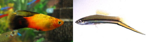
Platy (left) and Green Swordtail (right). Same genus, but only one has a sword-shaped tail.
Other species follow the same path. In Xiphophorus fish, only the swordfish has its anal fin elongated. The longer the tail, more successful the owner. In close-related species, like platy, on which that long fin inexists, the same bias repeats itself. If artificial tails are attached to the males, thay become more popular. Again, females still prefer something they have never seen before. Probably because they prefer bigger males.
In more and more species, from birds with more intricate melodies to mite with specialized appendages on their pedipalps, we find characteristics in one species that are not present in others of the same genus, but are quite successful among them. It is about those who manage to explore a tendency already present.
The implication is that preference for a trait is inherent to females according to the more utilized senses. It could be the “eyes” on the pattern of a peacock’s tail, since they are vision-oriented birds and need to be in constant lookout for predators. And that crest is sure to attract attention. Senses and nervous circuits that are already in constant use for, say, searching food – like a spider’s sense of touch – are co-utilized or re-routed for sexual function. Which is expected, for our senses resources are limited. [3]
Nothing more fitting for evolution. Females preference is already there and males born with tiny variations. The one with a novelty-colored fin or a more refined song will be chosen and have more descendents rather than their rivals without those characteristics. With time, that gene becomes so ordinary as to level the success rate of all males, until one displays another interesting change, and the cycle starts over.
After all, the ladies like surprises.
Sources:
[1] Smith, C. U. M. “Erasmus Darwin saw sexual selection before his grandson.” Nature 459, no. 7245 (Maio 21, 2009): 321. DOI:10.1038/459321d.
[2] Ryan, M., Fox, J., Wilczynski, W., & Rand, A. (1990). Sexual selection for sensory exploitation in the frog Physalaemus
pustulosus Nature, 343 (6253), 66-67 DOI: 10.1038/343066a0
[3] Ryan, M. (1998). Sexual Selection, Receiver Biases, and the Evolution of Sex Differences Science, 281 (5385), 1999-2003 DOI: 10.1126/science.281.5385.1999
A pixel, from Earth to the Moon, to the infinite and beyond
This is a translated version of this post, written originally in Portuguese by Kentaro Mori at 100nexos and translated by Carlos Hotta.
==============================================

Can you imagine a 1.700 km rock about 400.000 km from Earth? It is really hard for us to picture that. This rock, however, is our Moon. It is really difficult to grasp the Moon’s distance and dimensions, specially because our senses fool us. Try to represent with your hands, or even your arms, the size of the Moon in the sky. If you did that, you probably made a circle that is much larger than the one you see in the sky.
The angular size of the Moon is only half of a degree. If you extend your arm in front of you with your thumb pointing up, its width is about two degrees. That is right: if you extend your thumb towards the the Moon, you can cover it about four times. Even thought the Moon is 1.700 km. Go on and check yourself! ALmost everyone of us will overestimate the size of the Moon in the sky. Some of us will even use their arms when estimating it! This is called the Moon illusion. And this is why the Moon looks so tiny when we take a picture of it: cameras do not lie but our brains do.
We have been observing the sky above us for thousands and thousands of years. We have understood the celestial mechanics for a few centuries. And four decades ago, humans, with no more than six degrees of separation from you and I, have landed in the Moon. There you could not cover the Moon with your thumbs (unless you put then directly in front of your eyes, an occasion when you would see little else).
There are many ways to express how fantastic it was to land in the Moon. As we are talking about distances, please have a look at the image bellow – the inspiration of this post – and join me towards the infinite — and beyond.
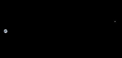
This image was created by Drew Olbrich, that wanted to correctly represent the scale between sizes and distances of the Earth and the Moon. We are used to see the pair represented in an artistic way, ignoring their true proportion. This is understandable, as you can see the emptiness between both bodies. This is the truth, however, the space is a great emptiness. In order to see this image in space, you would have to be approximately 560.000 km from where you are now. You may click the image to visit Olbritch’s site and check the image with higher resolution.
“This image has the most impact if you make it fill your whole screen and then turn off all the lights in the room” recommends Olbrich. “Stare at it for a while and try to imagine that you’re out in space looking back through some kind of bizarre porthole.”
Speaking of higher resolution, while I was contemplating Olbrich’s image I started thinking of what would be the size of Apollo space shuttle in the image. It would certainly be so tiny that it would be invisible to us. The next geekiest question would be: what should be the image’s minimum resolution to make the modules appear as a single pixel?
The command and service modules were about 11 meters high. The lunar module that landed in the Moon was about 6 meters high. Let’s be generous (and a bit mathematically lazy) and consider the whole set as 20 meters. If they were the size of a pixel, than the 400.000 km, or 400 million meters that separate the Earth from the Moon would occupy 20 million pixels.
20 million pixels is the equivalent of 10.147 full-HDTVs side by side if your resolution is 1980 pixels in the width. If your horizontal resolution is 1024, then you would need 10.531 HDTVs. If your screen is about 40 cm, it would be almost 4 km of screens.
Amongst all these screens, running for kilometers, a single point, a tiny pixel represents Apollo space shuttle. Everything else would be empty space. A single dust particle could accidentally cover the pixel. A dead pixel would cover it. And the three astronauts inside the shuttle would be even smaller. They would be still smaller than a pixel even if with kilometers of screens.
Now, picture yourself being inside this lone pixel.

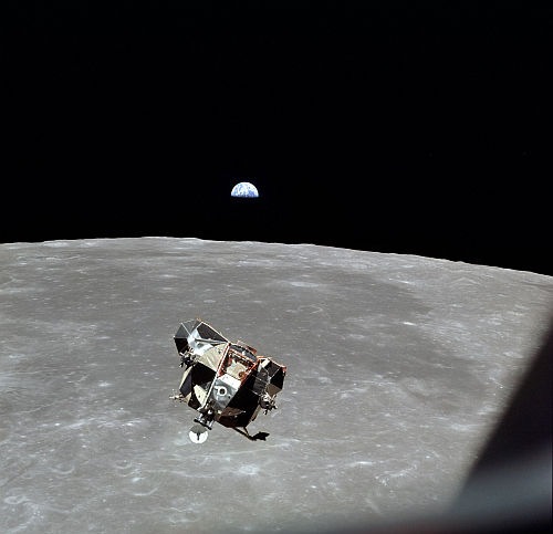
“I am alone now, truly alone, and absolutely isolated from any known life.” wrote Michael Collins while he was orbiting the Moon alone. Neil Armstrong and Buzz Aldrin were walking in our satellite for the first time in our epic naked-primate history. Collins loneliness may not seem so great if you imagine that, even though he was far from Earth, his two friends were “just” 105 km away. However, Collins was orbiting the Moon. He was 105 km away from his two friends only when he was directly above then. But he would still be in orbit. For two revolutions, Collins was over the dark side of the Moon, where not only were Amstrong or Aldrin unseen but communication with Earth was also impossible. These were the moments he was “truly alone”.
Collins also confided in his notes that “My secret terror for the last six months has been leaving them on the Moon and returning to Earth alone”. Try to imagine being smaller than that pixel and having to go through 4 kilometers of screens. “Now I am within minutes of finding out the truth of the matter, if they fail to rise from the surface, or crash back into it, I am not going to commit suicide; I am coming home, forthwith, but I will be a marked man for life and I know it.”
Fearful words that show an unknown side of Apollo 11 mission and the “forgotten astronaut”, detailed in an excellent article from Robin McKie at the Guardian. We now know that nothing like that happened. Fortunately, all manned missions to the Moon had three passengers counting with each other.
Which reminds me of something else.
Right now we are more than 6 billion astronauts that, in the words of Buckminster Fuller, make the Spaceship Earth. We are not alone, but all we can count on is each other. And while the Earth would fill a lot of screens, our planet is not really large. And is only one.
It would be impossible to end this post without mentioning that, as well as Apollo could be represented as a pixel lost in the middle of thousands of screens, Earth itself is a small pixel at the edge of the Solar Sysrem. It is a Pale Blue Dot. Collins fears were not a sign of weakness but a sign of sanity. These are the fears we need to have when we are reminded of how “truly alone” we are and how we are “absolutel isolated from any known life” besides our own, with or without considering other intelligent life in the rest of the Galaxy.
The loneliness abyss Collins felt us the same as we feel, in our Pale Blue Dot, since the dawn of mankind in the planet. The only difference is that many of us have not realized it yet.
We must take care of our tiny pixel. And seek other pixels – going to the infinite and beyond. And perhaps finding other lfeforms, “to boldly go where no man has gone before”. Or at least seed other pixels with naked primates. It should not be the fantasy of a few scifi geeks. It should be the natural drive of the whole species.
Collins conquered the abyss and safely returned with his friends, five other missions conquered the 400.000 km, landed on the Moon and came back. We are capable of achievements that are so literal and absurdly great that we cannot even grasp it – if oly we tried.
The subsidiary patient
Many times, in my practice, I am required to explain some statistical concepts to my patients in order to make them avoid some frequent pitfalls. The most common concept I explain is what is “normal” in lab exams.
Let’s suppose someone invents a new lab test to measure the glucose in the blood. How would we determine what are the normal values for this test? Once we are certain that the exam will not harm anyone, the researcher start looking for HEALTHY (this is important) subjetcs in order to measure their blood glucose levels. The researcher will probably measure thousands of blood samples, put them in a graph and what will she/he find?
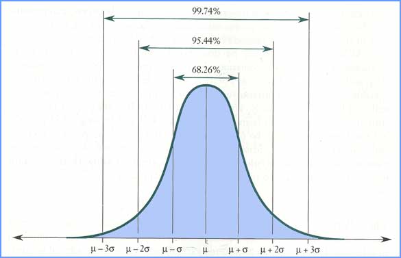
Normal distribution
The normal distribution has some interesting properties. The one we are using in this example is the one above. It is possible to calculate the proportion of the subjects (area under the curve) in each point. If we evaluate the area between μ-2σ and μ+2σ, we will find out that it corresponds to about 95,44% of the whole population Here you are. I thereby declare that the “normal” values in this alb tests are found between μ-2σ and μ+2σ, as 95% of all the healthy people are found in this interval.
Whenever a patient comes to see me, and I decide to test her/his glycemia using the method we have just described, there will be a chance, intrinsic to the method, that it will give a result that is out of the boundaries determined as “normal” limits, even though the patient is completely healthy. This chance, as explained, is about 5% (2.5% for each side of the distribution). Somebody may say: “OK, Karl, nothing is perfect and there is always margin for error.” I agree. The problem is that we never ask for only one exam. On one hand, patients love to do a full check-up “Please, test me for everything because my health plan will cover everything”. On the other hand, doctors love to ask for exams “I will ask for all the exams since blood will be drawn anyway”. In Brazil, doctors ask for an average of 1o to 20 tests per consulattion, depending on the specialization and health plan.
(OK, now it is time to PANIC) When we ak for 1 test, the chance of this test come back as NORMAL/NEGATIVE and the patient does NOT have the tested disease, is 95%, or 0.95. If we ask for 2 tests, the chances of both test come back normal and the patient does not have the tested disease is 0.95 x 0.95 = 0.9025. That means that there is about 10% of chance of one of the test come back as ABNORMAL/POSITIVE and the patient is healthy. If you consider 4 tests, the chances are 0.81 and when we achieve the number of 16 tests, the chances of one test coming back as abnormal is a THIRD!
The conclusion is quite important. Whenever I ask for a brazillion of tests, the chances that at least one of the results will come back abnormal and the patient is healthy is overwhelming. If I am, as I usually say, a doctor that is “hostage” of the exams, I will look for diseases where there are none! I will keep trying to fit the patient in the test results and not the opposite! This is what I call of “subsidiary patient, when the tests are what matter.
Some years ago, there was a trend in Brazil to take some flock of hairs and send them to USA, where they examined for almost all the elements in the periodic table! There were more than 50 exams. And who knows how the normal values for, let’s say, Cadmium, were established. The chance of at least one of the tests coming back as NOT NORMAL was close to 100%. Then, the doctor, in possession of the lab results, would say “Your Cadmium levels are high! We have to detoxify you!” and would prescribe you with some medicine. Some patients would become better, of course, and the rest of the herd would follow…
That’s something that is always on my mind: how many doctors today would have the guts to ignore a lab test just because it does not fit with the picture he drew from his patient? Hard question. Another: what kind of patients would believe his doctor if she/he decided to ignore the lab test? This one is easier: a patient that do not want to become subsidiary.
==================================
This post was written by Karl in his blog Ecce Medicus and translated by Carlos Hotta.
The miracle of the falling cat
A cat fell from the 26th floor in New York. What happened to the kitten? Nothing.

The name of the cat is Lucky. Of course, with a name like that, it was no surprise that a miracle saved him. According to the owner:
“That’s the thing about Lucky Miraculous,” HOSTETLER told “GMA.” “He has been [lucky] since we got him.” Source
NOT!
If the cat was really lucky, would it fall from the window? Does every miracle requires something bad happening before?
Actually, the cat would be more lucky if he had dropped the 7th floor and survived. Why?
Based on the records of cat falls, the rule “the higher, the worse” is not true. Moreover, a cat survived a 32 floors fall in the concrete, something like 450 feet, and only spent two days of observation and got a chipped tooth. Here is the figure everyone wants to see:
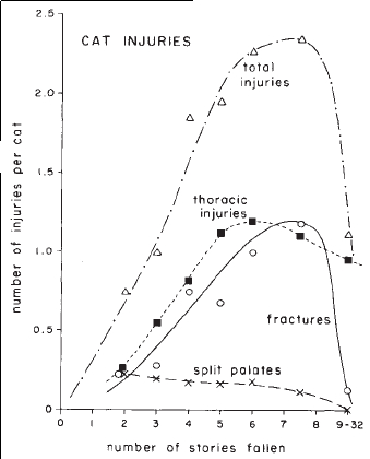
Source: Nature.
DISCLAIMER, nobody was throwing kittens out the window to calculate
the damage, these number are simply records of veterinary care
emergencies.
The majority of cats (90%) in this study survived (omitting the ones euthanatized by owners unable to afford treatment). The most common traumas of those who died were shock and thoracic injuries. The figure above shows that the frequency of injuries increase with the height but, instead of continuing and stabilizing at 100%, as would have happened if we were talking about people, it starts to fall! Cats suffer worst fates when they fall between the sixth and eighth floor.
Not all animals need to be afraid of gravity! Indeed, the vast majority of them, in number and diversity, do not. The damage suffered by cats that fall from different heights depends on two factors: the force that results from the animal’s mass and acceleration (gravity) F = Mxa and the area where the force is distributed F/A. Here lies the difference.
The larger the animal, the heavier it is, but the area it occupies does not increase proportionately. The size determines the weight of the animal, so the force it exerts when it falls increases in three dimensions, cubic. But the surface of the animal increases in two dimensions, a square relation. The greater the surface/volume ratio, the more air resistance the animal does and smaller is the final speed during his fall. Just think of a aluminum sheet dropping open or mashed.This means that ants, beetles, spiders and mice also do not need to worry about the height they fall. A fall of 1 foot or 20 thousand feet does not matter for them, since the final speed in fall is low and they distribute the impact in a relatively larger area. Meanwhile, any little fall for an elephant is dangerous.
When a cat falls, its terminal velocity (maximum speed in the fall) is about 60 mph, and the impact is distributed among the 4 limbs because the effective gyroscope that allows cats to turn during the fall and land almost always on feet, the vestibular system – hence the difference between a cat and a dog falling. Humans reach a terminal velocity of 120 mph and usually land on their head or legs, which means a more lethal fall, with more internal bleeding and head injuries.
When cats begin to fall, they stretch the limbs and increase their tension. When the height is greater, as in the case of higher floors, the cat has enough time to relax and let their limbs stay horizontally, increasing its surface, reducing the terminal velocity and distributing better the impact. By flexing the legs, they absorb the impact, as a spring. One of the most common injuries in cat drops is broken jaw, because the body relax as a whole and lets the jaw hit the floor.
Through their climbers history, the evolution of cats explains their nine lives. They need no miracle for that.
Diamond, J. (1988). Why cats have nine lives Nature, 332 (6165), 586-587 DOI: 10.1038/332586a0
========================
This post was translated by Atila from the original published at the Brazilian blog Rainha Vermelha.
A XIX century Photoshop Disaster
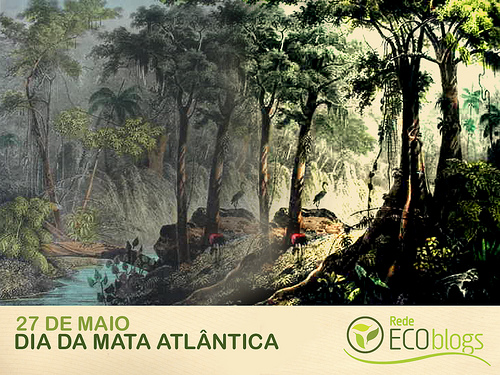
The Atlantic Forest is a little known tropical hotspot in the coast of Brazil. The blog network Rede Ecoblogs released the following image to celebrate the Atlantic Forest Day, in May 27th:
As you probably have noticed, there are four flamingoes displayed conspicuously in the image. However, there are NO flamingoes in the Atlantic Forest! Of course you may find flamingoes in Chile, Peru and Argentina, even in the extreme south of Brazil, but not in the our tropical forests. A very bad mistake for a network that is supposed to be all about ecology.
My first impulse was to blame their designer as the image was clearly photoshoped (the flamingos and their whereabouts were duplicated). Another possibility was that the image was not from the Atlantic Forest but somewhere else. Little I knew that the history behind image is way cool than a common intertube mistake.
The first step was to find the author of the original image and compare it to the one above. Paula Signorini helped me finding another example of the image:

At this other website, the image is annotated as “Rugendas – Mantiqueira”. In this image, the birds are blue, which was also added afterward as Rugendas published these images as lithographs in the beggining of the XIX century.
Rugendas was a German painter that is famous in Brazil for his illustrations depicting the Brazilian landscape and the people that lived here. His most famous work is the book “Picturesque Voyage to Brazil”, published in 1835. This book is the result of his adventures following the Langsdorff Expedition,which he abandoned (or was abandoned) before it arrived at the Amazon forest.
According to the ornithologist Dr. Guilherme Renzo Rocha Brito, who had help from the book “Rugendas e o Brasil” from Pablo Diener and Maria de Fátima Costa (editora Capivara), “Rugendas brought the original illustrations, made using oil paints or pencils, and part of the texts (actually, nobody knows who wrote those texts)… an editor put some money on the project and hired a few (8, I think) artists to make the lithographs. These artists, who had never been to Brazil, transformed the original illustration in stones. However, they took a lot of liberties in this transition, putting their own interpretations of Brazil and even signing the art!”
In summary: the lithographs where made by people that did not know Brazil and tried to carve the illustrations in stone only reading some texts and looking at Rugendas original work. Many of the artists, like the French A. Joly, the author of the flamingo pictures, interpreted the descriptions in their own way adding plant and animals that were not Brazilian (well, as the original illustrations were lost, it may be wring to blame Joly for the birds).
von Marthius, a naturalist that explored Brazil even commented: “I saw Rugendas’ drawing notebook. It seems to me that there is more aesthetic than truth. There are, for example, African birds in the jungle and Brazilian coniferous with palm trees in the mountains.(…) I have been seeing many of Rugendas’ work. I recommend it as an artistic conception and as a piece of French lithography. However, it is true that it is noticeable that many of these representations were done in Europe.”
Guilherme Brito also notes that the illustration is not from Serra da Mantiqueira, as written above, but the “Forét Viérge prés Manqueritipa / dans la province de Rio de Janeiro“or the Virgin Forest of Mangaratiba, at Rio de Janeiro province.
The lesson we take home is that illustrators try to retouch images since the XIX centuries, sometimes with disastrous results. What we cannot do is to replicate, and duplicate, the error in the XXI century.
Thanks to Lama for the help.
Images: Ecoblogs e As Minas Gerais
========================
This post was translated by Carlos Hotta from the original published at the Brazilian blog Brontossauros em meu Jardim.
1,000,000,000
Although it is not as large as one brazillion (which is 1 followed by as many zeros as it needs), one billion is still pretty huge.
It’s such a large number that our mammal brains have a great deal of difficulty trying to grasp the concept of 1 followed by nine zeros (for all you long-scalers out there, please note that I’m talking about a milliard — a thousand million –, not a million million, which we normal people would call a trillion).
At first glance, it may seem a bit useless or even unnecessary to understand such large amounts of zeros, but how are we suppose to comprehend the Avogadro constant, geological eras, the formation of galaxies and even Evolution otherwise?
I could tell you that 55g of iron has 600 times a million billion billion atoms until my feet hurt and that wouldn’t mean much to most people, because a number that large is exceptionally hard to visualize.
I would have the same problem if I was to discourse about the 4-billion-and-a-bit years the Earth has been around, or say that there are a billion billion planets in each galaxy (which, in turn, exist in even large numbers).
Can you imagine how long it took us to go from randomly floating chemicals to our current form as email-checking beings? I certainly cannot.
We are pretty good at understanding “ten of something”, but we lack intellectual capacity to perceive millions and billions.
That’s why we use analogies. For instance:
If you take five minutes to count to one thousand, keeping a steady pace, it will take you one hour to get to 12 thousand and you’ll reach 288 thousand at the end of 24 hours.
In one year, keeping the same rhythm, without ever stopping, you will arrive at 105 million: 365 days couting without rest or pause for breath would get you to a little bit over 10% of one billion, which would only be reached at the end of nine and a half years of incessant counting, at the pace of ten numbers every three seconds.
Or you could choose to go a number a second, if you have over 31 years to spare.
One billion minutes ago, around 100 C.E., Greek mathematician Ptolemy was being born, the wheelbarrow had just been invented in China, the last lions in the Balkan Peninsula were dying off, the Kama Sutra was starting to have its first pages written in India, bricks were the new trend in Roman housing development and, again in China, paper was though of being a pretty neat new idea.
One billion hours ago Australia was not inhabitated by humans and there was no agriculture and no domesticated animals. We were all basically living in Africa, chipping stones to slice meat off bones and fashion animal hide into early-days togas for our northbound walks into cold places. We would answer to erectus rather than sapiens and were just starting to develop language and music.
A strip of sand 10 meters long, one meter wide and 100 milimeters deep contains aproximately 800 thousand million grains of sand. 80% of a billion.
Due the curvature of Earth, It is impossible to see one billion people at the same time. That is so many people that even on the flattest land they would extend past the horizon.
The only way to fit one billion people into one’s field of view is to go up a few hundred kilometers above the surface of the planet 30-meter tree (thanks for the correction, Pierce!), from where they would look like a big blobby mass rather than separate individuals, much like what happens with our skin, which is formed by billions of individual cells.
By the way, one billion cells is equivalent to 350cm², or the skin of an adult human torso.
It is not necessary to repeat “one billion” billions of times like I did here in his article. One could also refer to it as: a thousand million, 10^9, one giga, bill, or a goddamn bucket-full.
—
By Igor Santos, original written here.
Deforestation does not lead to development
Science magazine has published a paper that is extremely important for the Brazilian Amazon. Brazilian researchers (IMAZON), in collaboration with researchers from other nations, evaluated the impact of the deforestation in the social and economic development in the affected Amazonian towns. The paper starts with some pretty impressive numbers: this country has 40% of the remaining tropical forests in the world. However, between 1998 and 2008, we took our forest down at a rate of 1,8 million ha/year (almost a third of the world’s tropical forest deforestation), releasing around 250 million tons of carbon every year. There are two patterns in Brazilian deforestation: we take the best wood first then we burn everything to make pastures or to make new crops. We are doing this conversion in a few decades, while it took centuries to other countries to do the same.
The advance of the deforestation in Brazil is justified by its advocates by the increase of the quality of life of the population around the forest areas. That’s it: environmental degradation leading to the increase of quality of life. In this context, the authors of the paper divided 286 Amazonian municipalities in 7 classes divided by when the deforestation took place and its extension. The classes ranged from pre-frontier (intact forest and no sign of the start of the deforestation) to post-frontier (severe deforestation and the shift to other economic activities). They also estimated the Human Development Index (HDI) for each municipality to estimate the development stage of each area. The HDI is the average of three other index: life expectancy, literacy and GDP per capta.
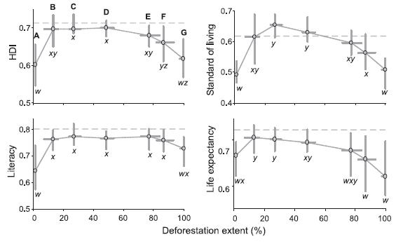
The HDI and its components in each municipality class (from the most preserved, A class, to the most degraded, G class).
As you amy observe, there is a pattern in the HDI and its components. There is a fast increase in the region HDI soon after the start of the deforestation. However, after this first moment of deforestation and resources over exploitation, there is the decrease of this index back to its original legal (there is no statistical difference between the A and G classes). This means that you may have development for a while but it vanishes with the natural resources. The authors of the paper also point out that Brazil’s HDI increased in the studied period but the HDI of A class and G class municipalities decreased.
What is the reason for this pattern? It is possible that the increase of the HDI is the result of the migration of people to the towns with intermediate deforestation levels as people with higher education levels and better financial status would arrive. However, this would not explain the sharp increase in the initial levels of deforestation, when the immigrants are largely poor people looking for a fresh start. An alternative explanation is the construction of infrastructure around the town, like roads and the initial profit with natural resources which allow a better access to services like doctors, etc. However, after a while, the profit levels decrease and the initial benefits are gone.
This shows how wrong the chaotic exploitation frame of the mind is. The whole “We are developing the Amazon region”is a lie! As everything in Brazil, only the richest benefit from the transitory development, accumulation all the profit from the natural resources. The poor are left with nothing. Deforestation do not increase the quality of life of the population that lives around the forest!
This means that it, in a first moment, is urgent to stop this model of deforestation followed by agriculture expansion. Next, we need to start the reforestation of degraded areas and to start investing in a sustainable exploitation of the forest (if such thing is possible). The authors also suggest the investment in carbon sequestration projects, as Brazil has large carbon stocks and a has advanced technologies to track changes in the forest. Once the Brazilian government understands that the forest worths more intact than destroyed, then we might understand what is development.
Rodrigues, A., Ewers, R., Parry, L., Souza, C., Verissimo, A., & Balmford, A. (2009). Boom-and-Bust Development Patterns Across the Amazon Deforestation Frontier Science, 324 (5933), 1435-1437 DOI: 10.1126/science.1174002
========================
This post was translated by Carlos Hotta from the original published at the Brazilian blog DIscutindo Ecologia.
Brazilian Megafauna: hard to hunt or to chew?
There is a mind boggling enigma in the South American fossil and archeological record, in special the ones found in Brazil. The first human beings to live here coexisted for at least a millennium, and probably a lot more, with mastodons, giant sloths, horses, bears and llamas. The Brazilian savanna was – 10 thousand years ago – a Serengeti 2.0. However, even though this huge mountain of animal protein is not around us anymore, there is NO convincing evidence that the first Brazilians have made them into a meal. NO evidence that the megafauna was hunted. Can anybody explain why?
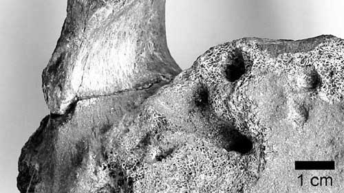
This old mistery came back to my mind after I interviewed the paleontologist Leonardo Santos Avilla, from Universidade Federal do Estado do Rio de Janeiro (Unirio), about his interesting work with Araxá (MG) mastodonts . He told me about tomographies made from these elephant’s extinct cousins that showed a foreign body that could be a spear point. The wound had heald, with means that the pachyderm (also known as gomphotherium) did not die from it.
This finding still need some confirmation but it would be the FIRST unquestionable evidence of a Brazilian Pleistoce monster being attacked by human beings. This means that we have better evidence that bettle larvae ate mastodonts (the above vertebra shows evidence that these scavengers were present in the rotting corpse) than we have for humans eating them.
Just to contextualize: it is good to remember that there is data that the megafauna (mastodonts) was used as food source 12.500 years ago, in Monte Verde (Chile) and a couple of examples in Argentina and andean countries. Apart from these examples, there is little evidence taht the first human inhabitants of this continent (as known as paleoindians) have hunted these large mammals.
Clovis? Clovis who?
The weirdest thing is that the so-called Clovis culture – apparently the oldest and certainly most known culture of this time period – seems to have survived almost exclusively eating mamoths in North America.The famous Clovis spear point, beautifully crafted and with special grooves to attach it to wooden spears, looks as if it was specially designed to hunt large mammals (and many were found in the middle of the ribs of proboscidians).
And here… well, here we only have a few paleoindian spear points. Most of the artifacts are very rudimentary. More importantly, the subsistence standards of places such as Lagoa Santa (MG), the most famous paleoindian occupation site in Brazil, suggests a major focus into the collection and capture of small animals such as armadillos, rodents and lizards. Who in the right mind would rather eat a lizard in a stick instead of a giant sloth beef?
I think that it is difficult to just conclude that Brazilian paleoindians were not skilled to make their own Clovis-like artifacts. Would it be possible that they invested in a strategy of “fewer risks and safer investiments” dedicated to smaller game? Finally, some researchers even suggest the existence of some sort of taboo associated to these large beast (totemic? religious? hygienic?) – that’s what the University of São Paulo bioanthropologist once suggested to me.
Of course that new findings, like the one from Dr. Avilla, may change this scenario, but I doubt it. Is this just a taphonomy problem, that the evidence of hunting has just disappeared or rotten? But that would have happened in the whole continent, which is unlikely. If anybody has a clue, fortheloveofGod tell me. Or write a paper.
============================================
This is a translated version of this post, written originally in Portuguese by Reinaldo José Lopes at Chapéu, Chicote e Carbono-14 and translated by Carlos Hotta.
About horned beetles
This is a translated version of this post, written originally in Portuguese by Atila Iamarino at Rainha Vermelha and translated by Igor Santos.
—————————————————————
Or “What don’t we do for women”..

Hard battle
Horns in beetles are a special feature. Not satisfied being male-only they are also unique among the insect species. And they are not made of mouth parts, nor antennae or even modified legs. They are horns. Horns that came to the attention of this Charles Darwin guy, who had a love affair with insects since his childhood and used the horned ones to explain sexual selection.
[Translator’s note: the terms “love affair with insects” and “sexual” were not meant to be related in that way].
Male beetles use those horns to battle for the females. They joust in restrictive environments, like tunnels dug by them for the egg-laying business of their lady counterparts. And, pretty much always, the longer the horn, the greater the number of victories, which translate into more fertilized females and more descendants

Like any structure subject to sexual selection (even though the choice is not up to the female, winning battles ensure reproduction), they are an impressive diversifying force. Horned beetles are extremely numerous and varied. Responsible for one of the greatest events in speciation, the diversity in shapes of horns are an example of the power of an evolutionary dispute.
Did anyone mention Red Queen?
An Infrared revolution
Some weeks ago, Science published a paper that may start a revolution in Medical and Biological Sciences and, possibly, the way some diseases are diagnosed. Before giving any detail about this paper, I will take a small detour.
In 2004, I had the opportunity to watch Roger Tsien talk in an imaging course. Following the informal environment of the course, Tsien showed some of his last creations in the world of fluorescent markers. It was when I concluded that someday he would get a Nobel Prize, which happened last year.

Tsien’s Nobel Prize was given by his use and abuse of the GFP, green fluorescent protein. As the name says, the GFP glows at the green wavelength (509 nm) after absorbing light in a certain wavelength (488 nm). If we make a tissue express GFP, we can monitor it using a fluorescence microscope. The same works if we attached a protein to GFP. Part of the academic life of Riger Tsien was dedicated to engineer better GFPs and other fluorescent proteins in order to generate a diverse colour palette, all used to understand the complex works of the cells.
One of the things that impressed me most in Roger Tsien’s seminar was his idea to develop fluorescent reporters in the infrared range. The key idea is: all fluorescent reporters work in the ultraviolet and visible range of the electromagnetic spectrum. However, these wavelengths are usually absorbed in living tissues, which does not happen with infrared wavelengths. This means that a infrared fluorescent reporter may be used to monitor whole organisms instead of using thin layers of cells.
Five years separate us from that seminar and some weeks ago Science magazine published a paper of the result of Rogen Tsien’s work: the IFPs (infrared fluorescent proteins). GFPs and the other fluorescent proteins were taken from jellyfish and corals whereas IFPs were modified from bacterial phytochromes. These proteins require and extra molecule to become fluorescent: biliverdin.
The IFPs are excited at 686 nm and emit at 713 nm, far from the strong absorptions of hemoglobin (everything bellow 650 nm) and water (everything above 900 nm). Ate the 650 nm to 900 nm, our body is basically transparent, which allowed Roger Tsien’s team to image the liver of a live mice expressing IFPs. In order to make the liver express IFP, they used a virus that only targets the liver to deliver the IFP genes. The biliverdin was delivered through injections. The final result is amazing: in the first image bellow, we can see the IFS without biliverdin. In the next, we may see the IFS with the biliverdin. In the third image, there is mKate, the best protein for this application before the OFS. In the last image we have the GFP, which is not detected. All that using an intact mice!

Using some techniques to treat the images, it is even possible to get clearer images of a liver expressing IFP! And this is only the first generation: by using evolutionary methods that create random mutations in the IFP, it will be possible to generate brighter proteins.

It is even possible to create equipments to generate high-definition images, which will make possible to make new and more accurate diagnostic equipments for Medical application. You can even picture the use of IFP to make tumors fluorescent and see how it is growing or to check if the newly introduced stem cells are growing well in the damaged spinal cord. All these scenarios are possible with IFP!
5 years ago I predicted that Roger Tsien would win a Nobel prize, has he just opened the possibility for a second prize?
Shu, X., Royant, A., Lin, M., Aguilera, T., Lev-Ram, V., Steinbach, P., & Tsien, R. (2009). Mammalian Expression of Infrared Fluorescent Proteins Engineered from a Bacterial Phytochrome Science, 324 (5928), 804-807 DOI: 10.1126/science.1168683
============================================
This is a translated version of this post, written originally in Portuguese by Carlos Hotta at Brontossauros em meu Jardim